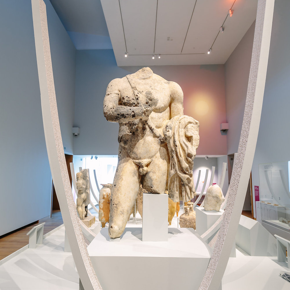
museum exhibition design
How to choose colour for art museum walls
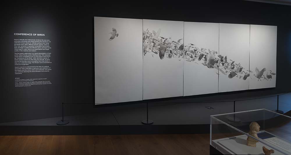
Generally, exhibitions artwork (and our home wall art) contains many different colours so finding a colour that works for all can be tricky. Hopefully, I can help you to find the right wall colour for your space to serve as the perfect backdrop for your wall art by looking at art museum walls. At the time of writing, there is an exhibition, currently open, which I had the pleasure of designing.
Ali Kazim: Suspended in Time, Ashmolean Museum, 7th Feb–26th June 2022.
The exhibition team comprised of:
- Artist: Ali Kazim
- Curator: Mallica Kumbera Landrus (Keeper/Head of the Department of Eastern Art and Senior Curator)
- Project manager: Agnes Valencak (Head of Exhibitions)
- Ashmolean Conservation, Mount-making and Installation team
- Print and build contractors: The Creative Key
I was both 2D and 3D designer on this project.
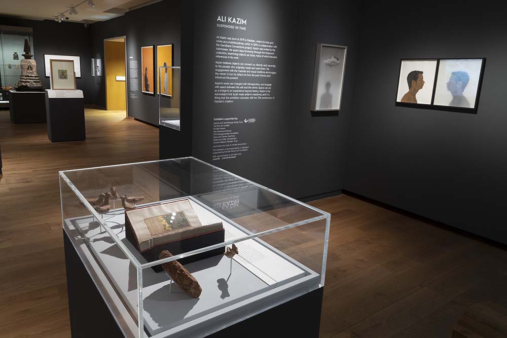
© Ashmolean Museum, University of Oxford
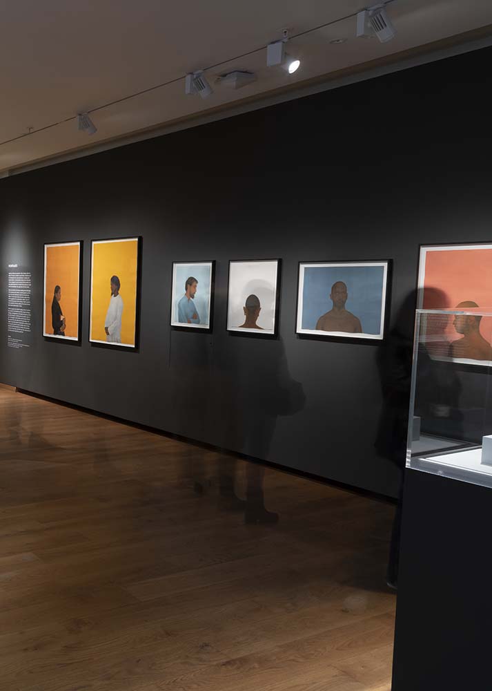
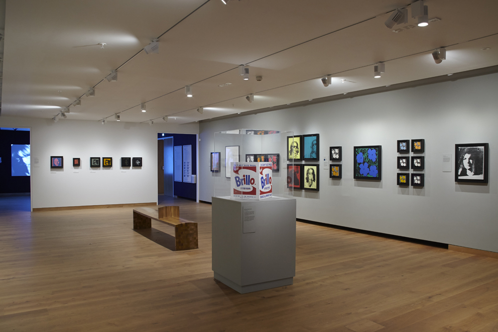
© Ashmolean Museum, University of Oxford
Design philosophy
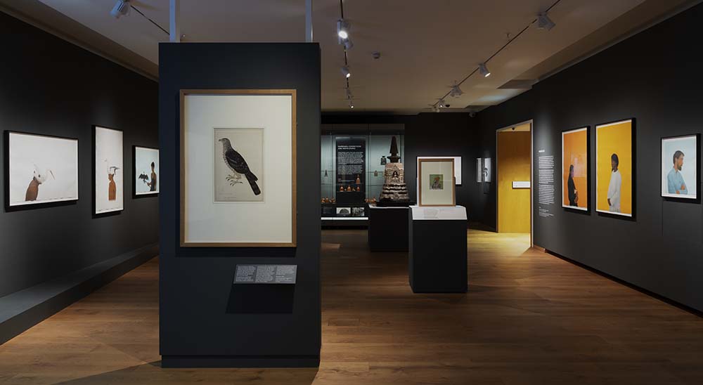
The artist and curator had a very clear approach to the grouping and layout- Ali’s work (which is largely wall mounted) to be hung on the gallery walls and the Ashmolean items (majority to be cased) to be centrally displayed.
Choosing the correct wall colour is a key exhibition design decision.
So, how did I do it? Well, I have an open approach to a project. It is important to gather all the design ideas when formulating the design brief because a designer can’t design an exhibition without team input. Ali and Mallica had discussed the colour prior to my involvement on the project which made my job relatively easy. They knew that the main art museum walls colour needed to be a warm, mid-dark grey. I absolutely agreed.
But why warm grey?
A standard grey (50% black mixed with 50% white) is less versatile than perhaps you would believe. This is because when it is used as the backdrop colour it can appear flat and draining.
Greys are much more interesting and usable with a small amount of other colour added- they are a neutral, muted form of the true colour. For example, if you add a bit of magenta and yellow to standard grey you achieve a grey/brown. Then there are the countless subtleties when you consider how much black and white and how much other colour to apply. I find that mixing a colour with standard grey adds a depth serving as a rich, contrasting, and elegant backdrop to the content of the room.
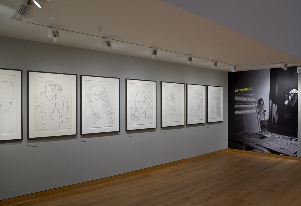
Ali’s work is largely bold and bright. There is a highlight piece (and one other), however, which is graphite on paper. The warm grey tone allows the colourful, bold works to ‘pop’ whilst harmonising next to the delicate works on paper. These principles were previously learned and applied in my Ashmolean’s Andy Warhol exhibition design in 2016 (article coming soon).
Which paint to choose
As with the Warhol exhibition, I had to find the right warm grey for the art museum walls. We can feel bamboozled by the huge choice of paint colours. There actually appears to have been an explosion of paint suppliers in the last 12 months as I see more adverts pop up on social media.
My ‘go to’ paint company was Dulux in my early career with a great deal of success. There had to be rather a lot of sampling though due to the large colour range which was time consuming. Then, I discovered Little Greene paint company who, like Farrow and Ball, have taken the headache out of selection and editing. They have a paired back and stunning colour range and have an excellent website where colour palettes are suggested. Many colours have a cultural reference which is interesting and helpful.
Some of my clients prefer using Little Greene because it is great quality paint requiring less coats. For museums with tight installation periods this is ideal because contractors take less time to repaint the galleries.
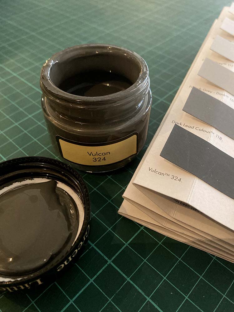
I proposed Little Greene’s Vulcan 324 as it is a warm deep grey which exudes depth, softness, and sophistication. I was so pleased, after sampling, when the client approved this colour.
There may have been a concern that the space would feel dark and gloomy which is true if the room had no content or lighting. The colour is a backdrop to the star of the show- the artwork and the graphics. Furthermore, it is important to see the 3D design as a set of layers which only works when everything is in place.
For more on wall colours check out these related articles: (coming soon) ‘Best paint colours for Pop Art colours’, ‘How to choose your interior colour scheme’.
Do you have a project you need a designer for? I may be able to help- see more of my exhibition design work here.
Are you looking for fine art or objects for your wall display? Go to 3 Legged Duck interior design shop online.
© Ashmolean Museum, University of Oxford

